
If you have been handed a problem to investigate and need to get structured thinking on the table quickly, a fishbone diagram is where I start. In this fishbone analysis example, I will walk you through the exact four-step process I use, including the categories I apply, the diagram structure, and what to do with the output once the bones are filled in. By the end of this article you will have everything you need to run your own session.
The fishbone diagram is also called the Ishikawa diagram or cause-and-effect diagram. I most often reach for it during the initiation phase of a project, when the problem is real but the causes are still murky. Like mind mapping, it works equally well as a personal thinking tool or as a facilitated group exercise. The difference is that fishbone forces you to categorise causes rather than free-associate, which produces a much more useful output for stakeholder conversations.
The Worked Example: Too Many Reported Product Bugs
On Project X, I was brought in during the first two weeks of a programme initiation to help the team understand why customers were generating an unusually high volume of support desk calls related to product defects. The stated problem was straightforward: too many reported product bugs. The effect was measurable. The causes were not.
The friction came early. The head of QA pushed back immediately when I proposed running a fishbone session. His position was that the problem was entirely a development resourcing issue and that going through a structured analysis exercise was a waste of time that would delay getting to the solution he already had in mind. I acknowledged his view, documented it on the diagram under People/Process, and invited him to disprove the other categories by participating. He joined. By step three he had added four causes under Data/Information that no one had previously articulated. That turnaround is exactly why the process is worth defending.
I used the free online drawing tool Gliffy to build the diagram during the session. Any equivalent tool will do. The structure is the same regardless of the software.
Step 1: Define the Problem
Write the exact problem statement on the right-hand side of the diagram. This is the head of the fish. Be specific. “Too many reported product bugs” is workable. “Things aren’t going well” is not. The more precisely you define the effect, the more honest the cause-finding will be.
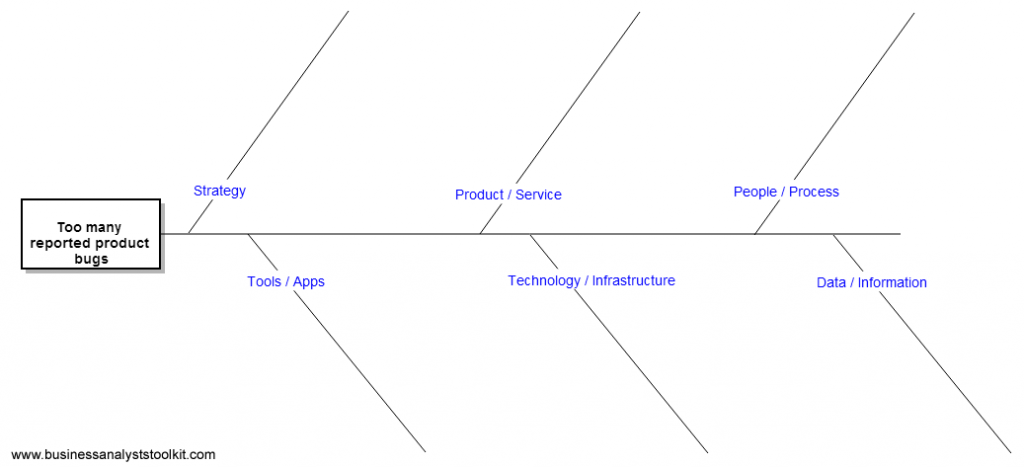
In the Gliffy diagram below, the problem is stated as: customers are reporting a high volume of product bugs, resulting in elevated support desk call volumes and issue resolution requests.

Everything to the left of that head becomes the body of the fish. Each bone represents a category of cause. Each sub-branch within a category represents a specific potential cause within that category.
Step 2: Identify the Main Contributing Categories
Rather than brainstorming into a blank space, I structure the main bones of the diagram using six categories that I have found cover the breadth of most business problems. These are not the only possible categories. Use whatever makes logical sense for your specific problem. But these six give you a defensible starting point in almost any domain.
- Strategy: Issues related to organisational direction, priorities, performance targets, or the absence of them.
- Product/Service: Issues with the design, specification, or quality of what is being delivered to the customer.
- People/Process: Issues with how work is done, who does it, and whether roles and responsibilities are clear and followed.
- Tools/Applications: Issues with the software, systems, or physical tools used to carry out the work.
- Technology/Infrastructure: Issues with the underlying technical environment, platforms, integrations, or architecture.
- Data/Information: Issues with the availability, accuracy, timeliness, or accessibility of information needed to make decisions or take action.
Add these as the main bones of the diagram before you start brainstorming. Getting the structure in place first stops the session from collapsing into a conversation about whichever cause someone feels most strongly about.
Step 3: Brainstorm Potential Causes
With the skeleton in place, work through each category and identify as many possible causes as the group can generate. Push for specifics. For each category in the product bugs example, the session produced the following kinds of causes.
Under Strategy, two causes emerged: no clear adherence to the product roadmap, meaning there was no sustained focus on reducing defect rates as a strategic objective, and unclear performance measures, meaning the organisation had no agreed metrics for tracking or reducing reported bugs. Both of these are upstream causes that could be driving everything else on the diagram.
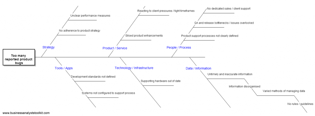
Under Data/Information, the QA lead who had initially resisted the session surfaced the most valuable contributions. He identified that there were no accessible reports showing bug trends by product area, no feedback loop from support desk data into the development backlog, and no agreed threshold at which a bug volume would trigger an escalation. These were causes he had never framed as information problems before, only as resourcing problems. The fishbone structure made the framing visible.
For any cause that warrants deeper investigation, you can branch further. This is structurally the same as applying The Five Whys within a single branch. Under Data/Information, for example, the cause “no accessible bug trend reports” could branch further into: no agreed reporting owner, no data extraction process in place, and no scheduled reporting cadence. Each of those branches is a discrete, addressable problem.
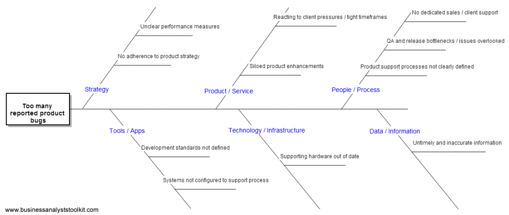
In practice I do not try to build a complete diagram in a single session. I aim for enough branches to make the main patterns visible, then refine with targeted follow-up. A diagram that is too complete in the room is often one that has been padded rather than one that reflects genuine analysis.
Step 4: Analyse the Diagram and Prioritise
Once all plausible causes are on the diagram, the analytical work begins. The diagram is not the deliverable. It is the input to a prioritisation conversation. What you are looking for is causes that appear across multiple categories, causes that are likely to generate the highest impact if resolved, and causes where you have enough information to move quickly.
In the Project X example, two causes stood out at this stage. The first was under People/Process: QA and release bottlenecks meant that issues were being overlooked before release, not because the QA team lacked skill, but because the release process did not allow sufficient time for regression testing. The second was under Data/Information: the absence of a structured feedback loop from the support desk into the development backlog meant that known bugs were not being systematically triaged or tracked. Both of these were tractable, had clear owners, and were contributing to the problem independent of the resourcing debate the QA lead had originally wanted to focus on.
This is a useful comparison to make explicit when you present the output. The table below shows how different categories of cause compare in terms of effort to investigate and potential impact on the problem.
| Category | Identified Cause (Project X Example) | Investigation Effort | Potential Impact on Problem |
|---|---|---|---|
| Strategy | No agreed performance measures for bug reduction | Low | High (enables all downstream action) |
| People/Process | QA and release bottlenecks, issues overlooked | Medium | High (direct driver of bug release rate) |
| Data/Information | No support desk to backlog feedback loop | Low | High (enables prioritisation and tracking) |
| Tools/Applications | No defect tracking tool integrated with support desk | High | Medium (depends on process fix first) |
| Technology/Infrastructure | Legacy environment limiting test automation | High | Medium (longer term dependency) |
| Product/Service | Unclear product ownership for quality standards | Medium | Medium (governance question) |
The analysis step is where the fishbone transitions from a thinking tool into a prioritisation input. If you are also working on a business case or scoping document at this stage, the prioritised causes from the fishbone feed directly into your problem statement and justification sections. This connection between tools is where the real value compounds.
When to Use This Technique
Fishbone analysis works best at the start of a project or investigation, before solutions have been committed to. It loses value if it is introduced after a preferred solution is already in place, because the conversation will unconsciously bend the causes towards justifying that solution rather than honestly exploring the problem. I have seen this happen on more than one engagement, and the resulting diagram rarely survives scrutiny.
It also works well as a personal tool when you are preparing for a kick-off meeting and want to anticipate the range of causes that stakeholders might raise. Building a draft diagram before the meeting gives you a structured frame to apply to what you hear, and it signals to stakeholders that you have already thought seriously about the problem space.
The fishbone diagram does not give you answers. What it gives you is a structured, visual record of the team’s thinking about a problem, organised in a way that makes interdependencies visible, prioritisation easier, and the conversation more honest than it would otherwise be. In my experience across government, utilities, and enterprise environments, the single biggest benefit of the technique is not the diagram itself but what happens to the room when people stop arguing about solutions and start mapping causes instead. That shift in conversation is worth the time the exercise takes every single time.
Frequently asked questions
What is a fishbone analysis example?
A fishbone analysis example shows a structured diagram where a defined problem is placed at the head of the fish and potential causes are mapped along categorised branches. A common example is investigating why customers are reporting a high volume of product bugs, with causes explored across categories such as strategy, people/process, and data/information. The resulting diagram makes it easy to identify which causes are most worth investigating and addressing.
What are the six categories used in a fishbone diagram?
The six categories most commonly used are strategy, product/service, people/process, tools/applications, technology/infrastructure, and data/information. These categories provide a structured starting point for brainstorming and help ensure that no major area of potential cause is overlooked. The categories can be adjusted to fit the specific problem you are investigating.
When should you use a fishbone diagram in business analysis?
A fishbone diagram is most useful during the initiation phase of a project, before solutions have been decided on, when the team needs to explore the causes of a known problem. It works both as a facilitated group exercise and as a personal thinking tool when preparing for stakeholder workshops or kick-off meetings. Introducing it after a preferred solution is already in place reduces its effectiveness significantly.
What is the four-step process for building a fishbone diagram?
The four steps are: clearly define the problem and place it at the head of the diagram, identify the main contributing categories and add them as the primary branches, brainstorm specific potential causes within each category and add sub-branches, and then analyse the completed diagram to prioritise causes by likely impact and ease of investigation. Each step builds directly on the previous one.
How is a fishbone diagram different from the Five Whys technique?
The fishbone diagram maps causes across multiple categories simultaneously, giving a broad visual overview of all possible causes of a problem. The Five Whys technique drills vertically into a single cause by repeatedly asking why until a root cause is reached. In practice the two techniques complement each other well, with Five Whys used to deepen analysis within individual branches of the fishbone diagram.
Try Ash, Your Virtual BA
If you are working through a problem investigation right now and want to move quickly from the fishbone session into structured documentation, Ash can help you get there. Ash is built for BA practice and can guide you through framing your problem statement, structuring your findings, and producing the kind of clear, stakeholder-ready analysis that turns a cause-and-effect diagram into actionable next steps. Try Ash Virtual BA and see how fast you can move from a whiteboard full of causes to a document your sponsor will actually read.
Further reading
Written by Sam Cordes, founder of the Business Analyst’s Toolkit.